
I’m not much for writing this evening so I’ll outsource most of this. To Doug Muder for the intro:
“[Last week] a controversy broke out in economics, and it actually deserves your attention. A paper that has had a major influence on public policy around the world turns out to be wrong. And not just wrong in a subtle way that only geniuses can see, or even wrong in an everybody’s-human way that you look at and say, “Oh yeah, I’ve done that.” This one was wrong in three different ways that make you (or at least me) say, “That can’t be an accident.”
The bogus paper came out in 2010: “Growth in a Time of Debt” by Carmen Reinhardt and Ken Rogoff (both from Harvard). The paper that refutes it appeared last Monday: “Does High Public Debt Consistently Stifle Economic Growth? A Critique of Reinhart and Rogoff“ by Thomas Herndon, Michael Ash, and Robert Pollin (all from the University of Massachusetts).
Handoff to Paul Krugman:
The intellectual edifice of austerity economics rests largely on two academic papers that were seized on by policy makers, without ever having been properly vetted, because they said what the Very Serious People wanted to hear. [One of those papers] was Reinhart/Rogoff on the negative effects of debt on growth. Very quickly, everyone “knew” that terrible things happen when debt passes 90 percent of GDP.
Some of us never bought it, arguing that the observed correlation between debt and growth probably reflected reverse causation. But even I never dreamed that a large part of the alleged result might reflect nothing more profound than bad arithmetic.
But it seems that this is just what happened. Mike Konczal has a good summary of a review by Herndon, Ash, and Pollin.
Long story short, Reinhart and Rogoff (RR) screwed up the Excel spreadsheet they used to derive their conclusions. RR’s conclusion that ohmygodwereallgonnadie if debt exceeds 90% of GDP? Invalid. They used the wrong numbers omitted some critical data from their analysis.
Here’s Jared Bernstein‘s chart summarizing the effect of RR’s error on the calculated correlation between debt-to-GDP and GDP growth levels. Notice that things look far less grim at the debt >90% GDP level when the error is corrected.
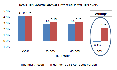
Konczal’s post (also linked to above) gets into the details. It’s worth noting that there were calls early on for RR to release their data. Nevermind avoiding professional embarrassment, RR’s paper had a significant and unfortunate effect on public policy.
Still, it does appear from Jared’s summary chart that higher debt-to-GDP ratios correlate with lower growth ratios. Things don’t fall off a cliff for debt >90% GDP when RR’s error is corrected but it does appear that there’s a modest negative correlation. Does the apparent correlation hold up when you dig into the data and analyze it rigorously? No. The apparent trend is due to the way RR aggregate their data before analyzing it. (Jared’s chart shows the result obtained using aggregated data after RR’s coding error is corrected.) Using aggregated data is poor practice in this case. It precludes the possibility of identifying signs of cause and effect. UMass economist Arindrajit Dube gets into the details and demonstrates this. He shows that there’s a correlation between current debt-to-GDP ratio and past growth but essential no correlation between current debt-to-GDP ratio and future growth. First he revisits RR’s data:
Recent work by my colleagues at UMass Thomas Herndon, Michael Ash and Robert Pollin (2013)—hereafter HAP—has demonstrated that in contrast to the apparent results in Reinhart and Rogoff (2010), there is no real discontinuity or “tipping point” around 90 percent of debt-to-GDP ratio.
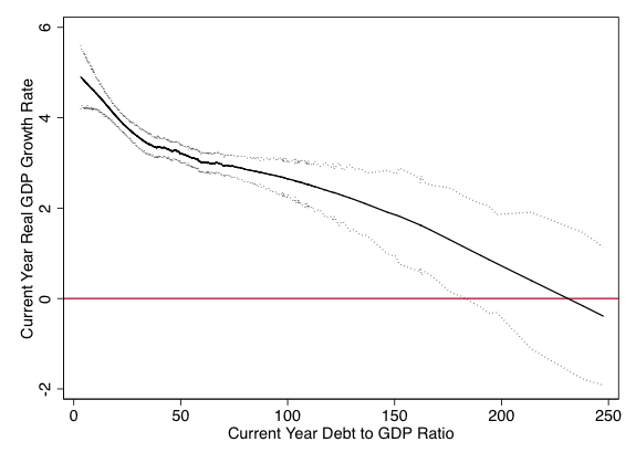
In their response, Reinhart and Rogoff—hereafter RR—admit to the arithmetic mistakes, but argue that the negative correlation between debt-to-GDP ratio and growth in the corrected data still supports their original contention. Taking the Stata dataset that HAP generously made available as part of their replication exercise, I first reproduced the nonparametric graph in HAP (2013) using a lowess regression (slightly different than the specific method they used). The dotted lines are 95 percent bootstrapped confidence bands. [Note: Links for lowess regression and bootstrapping.]
He then asks whether debt-to-GDP ratio is correlated with past or future growth rates. Doing so requires digging into the data deeper than RR did:
While it is difficult to ascertain causality from plots like [the one above], we can leverage the time pattern of changes to gain some insight. Here is a simple question: does a high debt-to-GDP ratio better predict future growth rates, or past ones? If the former is true, it would be consistent with the argument that higher debt levels cause growth to fall. On the other hand, if higher debt “predicts” past growth, that is a signature of reverse causality.
Below I have created similar plots by regressing current year’s GDP on (1) the next 3 years’ average GDP growth [lefthand figure], and (2) last three years’ average GDP growth [righthand figure]…
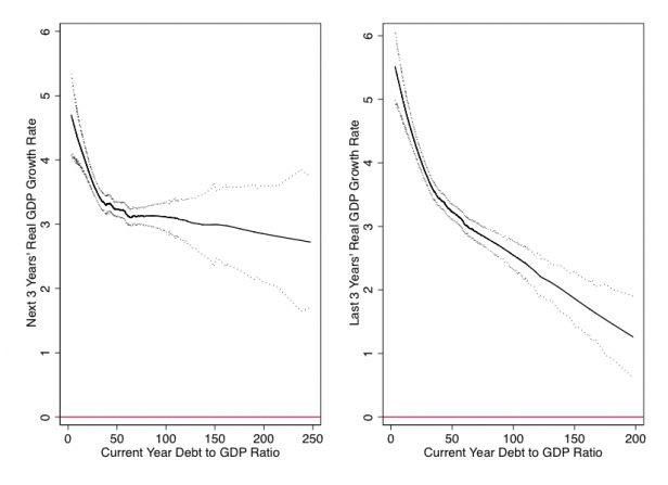
As is evident, current period debt-to-GDP is a pretty poor predictor of future GDP growth at debt-to-GDP ratios of 30 or greater—the range where one might expect to find a tipping point dynamic. But it does a great job predicting past growth. [Note the confidence intervals as well as the mean trend in both the lefthand and righthand plots.]
This pattern is a telltale sign of reverse causality. Why would this happen? Why would a fall in growth increase the debt-to-GDP ratio? One reason is just algebraic. The ratio has a numerator (debt) and denominator (GDP): any fall in GDP will mechanically boost the ratio. Even if GDP growth doesn’t become negative, continuous growth in debt coupled with a GDP growth slowdown will also lead to a rise in the debt-to-GDP ratio.
Besides, there is also a less mechanical story. A recession leads to increased spending through automatic stabilizers such as unemployment insurance. And governments usually finance these using greater borrowing, as undergraduate macro-economics textbooks tell us governments should do. This is what happened in the U.S. during the past recession. For all of these reasons, we should expect reverse causality to be a problem here, and these bivariate plots are consistent with such a story.
Dube concludes:
So what does this all show? It shows that purely in terms of correlations, a 10 point increase in the debt-to-GDP ratio in the RR data is associated with a 6/10 of a percentage point lower growth in the 3 years prior to the increase, but actually a slightly larger than usual growth in the few years after the increase. During the year of the increase in debt-to-GDP ratio, GDP growth is really low, consistent with the algebraic effect of lower growth leading to a higher debt-to-GDP ratio.
All in all, these simple exercises suggest that the raw correlation between debt-to-GDP ratio and GDP growth probably reflects a fair amount of reverse casualty. We can’t simply use correlations like those used by RR (or ones presented here) to identify causal estimates.
Bottom line: Our world is extremely unlikely to end as a result of the debt-to-GDP ratio rising above 0.90, i.e., debt becoming >90% of GDP. In fact, there’s essentially no correlation between future GDP growth and debt-to-GDP ratio when debt exceeds 30% of GDP. (Government debt is currently about 77% of GDP and its not forecast to change dramatically.) So don’t get worked up about additional debt which would be incurred by fiscal stimulus. The potential benefits of fiscal stimulus (i.e., a temporary boost in government spending) far outweigh the risk associated with taking on additional debt.